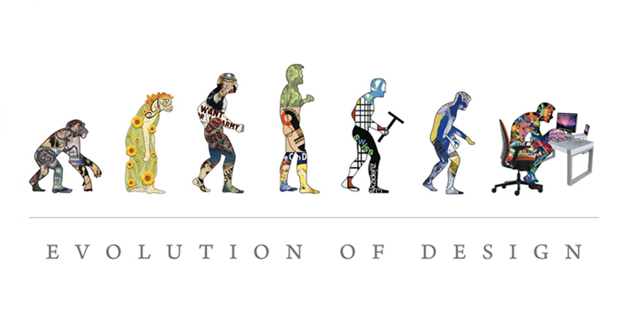
We are all familiar with the growing trend of “simple is better,” “less is more,” white space minimalist designs. It has taken over our popular go-to websites whether you’ve noticed it or not. So why is it all the rage?
Let’s compare then and now:
The not-too-distant Then (whether in web or mobile design) attempted to merge all our possible information and creativity into fantastic designs.
Ornamentation was key. Remember those somewhat gaudy notepad or calculator apps textured leather finishes and bevel shadows? Let’s not forget the realistic page turns screaming superfluous visuals(!) that made you feel as if you were reading an actual book.
 Turns out this actually has a name—skeuomorphism, the creation of designs or elements on one object or interface to create/imitate the illusion of another material.
Popular user interfaces such as Apple iOS 6 feature a page turn or curl feature, allowing you to take a peek at what was under the page you’re currently on, without the commitment. Because this generation hates commitment, doesn’t it?
Microsoft’s Windows Vista interface produced a misty glass-like platform for all windows and utilities to perform on—including the three-dimensional illusion of them piling on top of each other. The outreaching of new styles and yearn to make things as realistic as possible was parallel to our technological ambitions. The Manifest Destiny of design, if you will.
The new Apple iOS 7 and Microsoft Windows 8 interfaces reflect a step into a new direction—a “minimalist” one, some may say. This is where we should make the distinction.

The professionalism we aim for in our mobile user interfaces or websites is not created simply through a minimalist design. We are not just taking out superfluous lines and shadows or the extra words that jumble up our understanding of the core concept. Here the aim is to create an “authentic design” which Dmitry Fadeyev, the creator of Usaura and founder of UsabilityPost, states is “about using materials without masking them in fake textures, showcasing their strengths instead of trying to hide their weaknesses.” There is strength in flatting our designs and providing information without superfluous design.
The simpler Now focuses on content and on the functionality of our apps…
With a clean design that refuses to take away from the end goal. When creating a webpage, an app, or anything involving interface design (basically anything now-a-days), don’t forget not to lose sight of what the end goal is.
We tend to get excited about new colors and textures; I mean I still do when it’s about candy… And there’s nothing wrong with such details in moderation. And with that mindset, we can begin constructing our own company or personal website.
First, prioritize the framework of your focus, the main pieces of information and how it would best be showcased and worded. Is it data and information-based or is it visual-based?
Only next, can you build off that framework, developing an intrinsic style of design for your company—one that flows throughout the site and will be recognized by your clients. Pinpoint the layout you would like, as well as the shapes and figures that will form it.
Lastly, don’t ever forget that some extraneous details are meant to be removed, to foster a more smooth understanding of the interface and its functions. Flat is the trend now, but it does not mean you must keep everything 2D only. Lure your audience in and make sure they don’t flee within the first two seconds—make sure your website glides with ease from one topic to another, one focus to the next.
And with that, here’s to recognizing that it’s not minimalism we want. Trends fly by so quickly you hardly get settled on them (what do you think will be the next big thing, after the “flat” design?). Instead it’s the innovative technique of minimizing the trouble any viewers may have on your site. Simple is best as long as you don’t detract from the points you are dedicated to making.
